Introduction: Why Colour Selection is Critical in 2025 Home Renovations
When renovating your home, colour is more than just paint—it's psychology, personality, and functionality rolled into one. In 2025, colour selection has evolved beyond simple aesthetics. It plays a vital role in defining energy, comfort, sustainability, and even resale value.
Whether you're updating your apartment in Gurgaon or renovating a villa in South Delhi, choosing the right colours can enhance space, reflect natural light, and align with your lifestyle goals.
This guide will walk you through how to choose the best colours for your home renovation in 2025—with expert-backed tips, trending palettes, and vastu-aligned shades for Indian homes.
Why Colour Matters in Home Design
Colour affects:
- Mood: Cool tones soothe; warm tones energize.
- Space perception: Light colours open up spaces; dark tones create intimacy.
- Natural light reflection: Right shades can enhance or soften sunlight.
- Harmony: Unifying colour schemes create a seamless visual experience.
- Resale appeal: Neutral palettes appeal to wider audiences.
So, whether you're doing a full home makeover or a simple room update, the right palette is key to success.
Step-by-Step: How to Choose Colours for Your Home Renovation
✅ Step 1: Assess Natural Light in Each Room
Rooms with plenty of sunlight can carry cooler or deeper hues (like navy blue, sage green). In contrast, dimly lit rooms need warm or neutral tones to brighten the space.
✅ Step 2: Define the Mood You Want
Ask yourself: Should the room feel cozy, airy, luxurious, playful, or grounded? Match your colours accordingly:
- Calm = muted blues, greens
- Energetic = yellows, oranges
- Elegant = charcoal, beige, gold accents
- Earthy = terracotta, clay, olive
✅ Step 3: Consider Your Furniture & Flooring
Your existing wood tones, tile colours, or upholstery should complement—not clash—with your wall colours. Neutral walls often allow flexibility with colourful decor.
✅ Step 4: Think Long-Term
Trendy colours fade fast. Choose a palette that’s timeless but adjustable—you can add colour pops with cushions, wall art, or curtains.
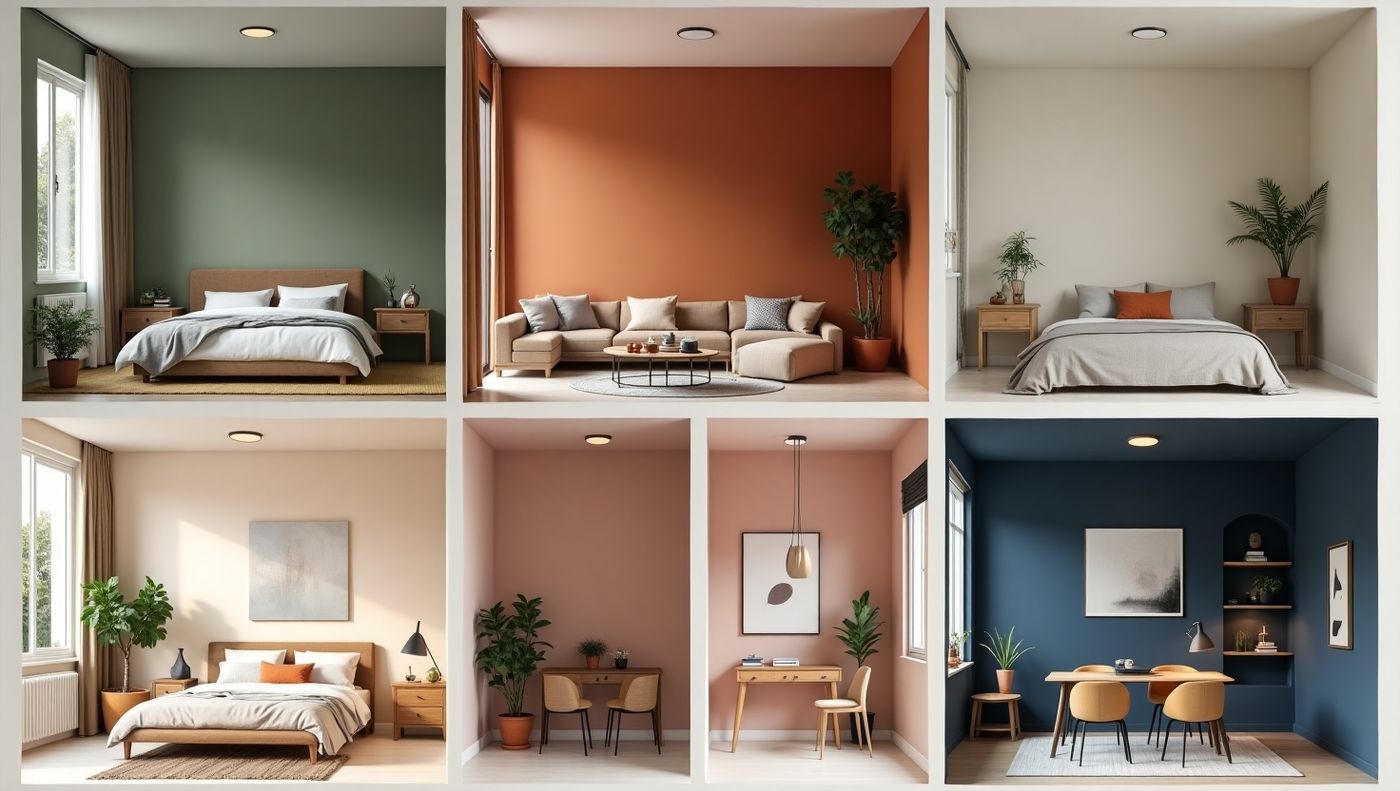
Top Interior Colour Trends for 2025
In 2025, colour trends blend technology, sustainability, wellness, and tradition. Let’s look at the most popular picks.
🎨 1. Earth-Inspired Neutrals
Beiges, taupes, sand, and mushroom tones remain a favourite for modern homes. They create a grounding effect and suit Indian lighting conditions.
Best for: Living rooms, master bedrooms, dining areas
🎨 2. Soft Sage Green & Olive
Biophilic design is hot in 2025. Greens are linked with wellness, nature, and healing. Light sage pairs beautifully with wood and whites.
Best for: Bedrooms, study areas, reading corners
Vastu Tip: Green is linked to balance and prosperity—ideal for east-facing rooms.
🎨 3. Warm Terracotta & Clay
Rich, rustic tones like burnt orange, clay red, or cinnamon bring warmth and cultural depth to Indian homes.
Best for: Accent walls, pooja room backdrops, balconies
🎨 4. Blue-Grey & Soft Navy
Cool yet grounded, these hues offer a balance of elegance and calm. Matte navy is replacing basic greys as the new luxury backdrop.
Best for: Study rooms, home offices, guest rooms
🎨 5. Lavender Mist & Blush Pink
These subtle, pastel hues are trending for their uplifting, dreamy aesthetic—especially in millennial homes.
Best for: Kids' rooms, vanity corners, creative spaces
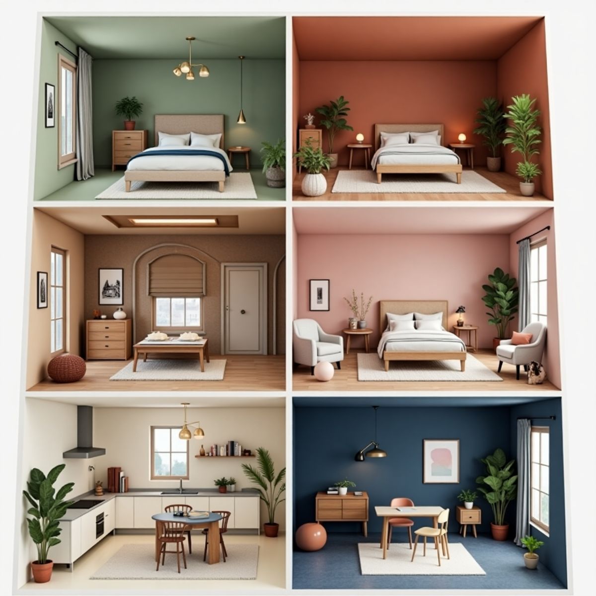
Room-by-Room Colour Guide for 2025
Here’s how to select the best colours based on functionality, light, and vastu direction.
🛋️ Living Room:
- Top Picks: Warm beige, off-white, terracotta, pale gold
- Tip: Use an accent wall behind your sofa for visual depth.
- Local Tip: South Delhi homes with natural light benefit from muted greys or olive tones.
🛏️ Bedroom:
- Top Picks: Sage green, lavender, cream, blush
- Vastu Tip: Avoid fiery reds; opt for calming colours like blue or earthy tones in SW rooms.
🍽️ Dining Area:
- Top Picks: Peach, light mustard, muted coral
- Mood: Choose colours that stimulate appetite and conversation.
🍳 Kitchen:
- Top Picks: Ivory, teal, mint green, terracotta tiles
🛁 Bathroom:
- Top Picks: Dusty blue, aqua, pale grey, or marble white
- Look & Feel: Clean, spa-like, fresh
📚 Study/Home Office:
- Top Picks: Soft navy, light grey, olive green
- Tip: Colours that enhance focus and don’t strain the eyes.
How to Create a Colour Palette (Even Without a Designer)
Use the 60-30-10 Rule:
- 60% – Dominant wall colour (neutral or base tone)
- 30% – Secondary colour (furniture, curtains)
- 10% – Accent (art, lamps, cushions)
Try free tools like:
- Canva Colour Palette Generator
- Asian Paints "Colour Visualizer"
- Sherwin-Williams Snap It
Common Mistakes to Avoid When Choosing Colours
Choosing colours in artificial light
→ Always test paint patches during daylight.
Using too many bold colours
→ Creates chaos. Stick to max 3 core colours per room.
Ignoring the ceiling and trim
→ Paint these in lighter tones for contrast and clean finish.
Overlooking the flooring effect
→ Dark floors + dark walls = smaller room feel.
Blindly following trends
→ What works in Pinterest homes might not suit your space or light.
Vastu-Approved Colours for Home Renovation
In Indian homes, vastu shastra remains an important factor.
Here’s a quick vastu colour chart:
Room Direction Recommended Colour Avoid
East Green, light blue Grey, black
South Red, orange, coral Pale blue
North Blue, silver Red
West White, grey Brown, yellow
Northeast Yellow, cream Dark blue, Red
Southwest Earthy tones, beige Greens
Low-Budget Colour Ideas for Small Homes
If you're renovating in a budget range (₹50,000–₹1,00,000), here's how you can still refresh your home with colour:
💸 Budget Tips:
- Use accent wall paint instead of painting full rooms
- Opt for wall stickers or decals in kids’ rooms or hallways
- Repaint old furniture for a fresh look
- Add colourful curtains and upholstery to balance white walls
🪄 Delhi NCR Local Hack:
Markets like Banjara Market (Gurgaon) and Bhikaji Cama Place (Delhi) offer discounted decor and stencils for DIY painting.
Paint Finishes to Consider in 2025
Not just colour, the finish matters too.
- Matte Finish: Modern, hides wall imperfections
- Satin Finish: Slight sheen, easy to clean
- Glossy Finish: Reflective, best for trims or doors
- Textured Walls: Create depth; great for living rooms
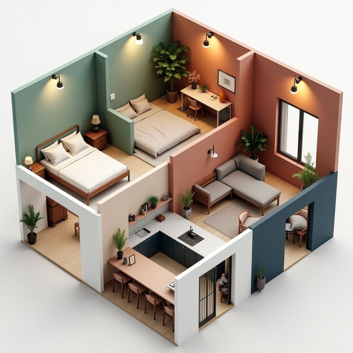
Miggla's Colour Recommendations for 2025 Homes
As one of the top interior designers in Delhi NCR, Miggla offers curated colour combinations based on lifestyle, space size, and vastu orientation. Our favourites for 2025 include:
- Sage + Terracotta + Ivory (modern-boho look)
- Olive Green + Mustard + Charcoal (bold earthy palette)
- Beige + Wood + Off-white (timeless Indian elegance)
Conclusion: Colour Is the Soul of Renovation
A fresh coat of paint or a thoughtful palette change can transform your space, mood, and energy. In 2025, the best colours are those that are rooted in wellness, inspired by nature, and designed to last.
Before picking up that paintbrush, consider your light, layout, budget, and personal taste—then blend in vastu tips and expert guidance from professionals like Miggla.
FAQs – Home Colour Selection for 2025
Q1. What are the best colours for Indian homes in 2025?
Sage green, terracotta, beige, dusty blue, and warm neutrals are top picks for their timeless appeal and compatibility with Indian lighting.
Q2. How do I test colours before painting a room?
Use sample patches on walls. Check them at different times of the day under natural and artificial light.
Q3. Can colour affect mood and productivity?
Absolutely. Greens and blues calm the mind, while yellows and oranges boost energy. Ideal for bedrooms and workspaces respectively.
Q4. What’s the most versatile colour for all rooms?
Warm beige or soft ivory—they suit most decor styles and lighting conditions.
Q5. How can Miggla help in colour planning?
Miggla offers expert consultation, custom palettes, and vastu-aligned plans for homes across Delhi NCR – Gurgaon, Noida, Faridabad, South Delhi, Greater Noida, and more.
Need Help with Colour Selection? Connect with Miggla Today!
Whether you’re revamping a single room or renovating an entire home, Miggla’s expert interior team offers:
- Personalised colour palette consultation
- Vastu-compliant planning
- Paint + material execution support
- Moodboard & 3D renders
📞 WhatsApp Us: +91 9899890157
🌐 Website: www.miggla.com
📍 Studio in Delhi
